Color choices for kitchen cabinets are more than a matter of taste. They are shaped by centuries of tradition, regional aesthetics, and social symbolism. If you’re working with a China cabinet maker or sourcing custom kitchen cabinets from China, understanding the cultural context behind color can help you design a kitchen that reflects not just style, but story.
Cultural Impact on Cabinet Colors
It’s fascinating how the same hue can evoke vastly different emotions across cultures. Red, for instance, symbolizes joy, prosperity, and good fortune in China, while in many Western cultures, it often signifies danger or emphasizes importance. White, frequently associated with purity and cleanliness in the West, can be linked to mourning in some Asian countries. Black, on the other hand, conveys modernity, luxury, and authority in the West, but in the East, it often suggests serenity, introversion, and nobility. These differences aren’t just arbitrary; they’re deeply rooted in shared histories and aesthetics.
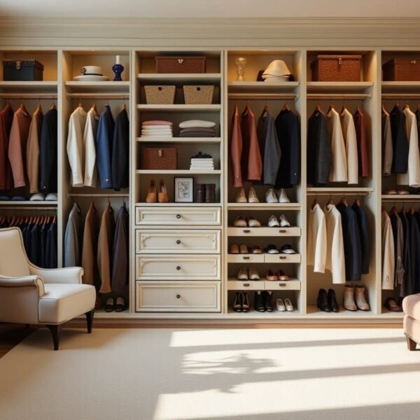
A World of Kitchen Cabinet Aesthetics
Let’s embark on a colorful journey to understand how regional cultures influence cabinet color preferences. This is vital when you’re looking for a China cabinet manufacturer who truly understands diverse design sensibilities.
East Asia: Minimalist & Nature-Inspired Palettes
East Asian design embodies a “muted philosophy” centered on the beauty of negative space and reverence for nature. In China, redwood or dark brown paired with gold is common. These redwood hues echo traditional Ming and Qing dynasty furniture, symbolizing stability and wealth, while gold hardware, often seen on China cabinet maker creations, resonates with the cultural emphasis on attracting prosperity. For a luxurious touch, consider pairing vermilion with matte gold hardware, reminiscent of traditional lacquerware. Japan often features off-white, natural wood, and light gray. These tones stem from the “natural authenticity” of “washitsu” (traditional Japanese rooms) design, influenced by Shintoism, with light gray extending modern minimalism and reflecting “Zen” aesthetics. Incorporate light indigo (from traditional “Aizome” dyeing) with wood grain textures to embody Wabi-sabi philosophy. In South Korea, light pink, beige, and white are popular, derived from the “paper doors” and “ondol” (underfloor heating) culture of traditional Korean houses, emphasizing warmth and comfort.
Southeast Asia: Vibrant Tropical Blends
Southeast Asia embraces a “vibrant clash” of tropical flair, full of vitality and natural vibrancy. Thailand often sees lime green paired with turmeric yellow. Lime green, reminiscent of tropical plants, symbolizes freshness and vitality, while turmeric yellow, from traditional curry, reflects culinary culture. In Vietnam, light blue and off-white are common. Light blue, drawing inspiration from the Mekong River and Vietnamese tiles, and off-white, from rice paddies, emphasize nature and local heritage. Indonesia frequently features gamboge and deep red.
South Asia: Rich & Celebratory Hues
South Asia’s aesthetic is a “rich revelry” of religion and festivals, emphasizing the sacred, auspicious, and traditional. India often showcases terracotta red, peacock blue, and gold. Terracotta red, from mud walls, symbolizes land and harvest; peacock blue, seen in Rajasthani attire, signifies sacredness and nobility; and gold, deeply rooted in Hinduism, represents divinity. In Pakistan, deep green and off-white are common. Deep green, a sacred color in Islam, and off-white, representing the desert, balances the richness of the palette.
Have a project in mind? Send a message.
Get the catalog for free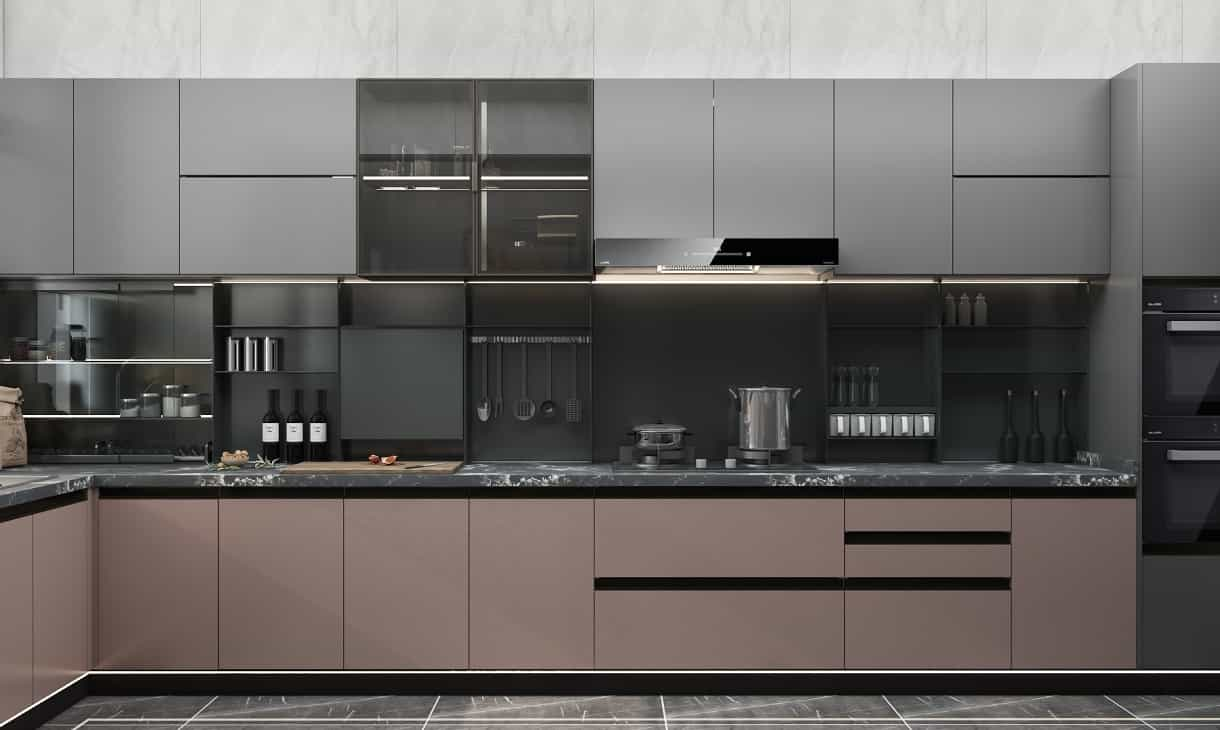
Middle East: Desert & Tile Dialogues
The Middle East features a “blue-orange dialogue” of desert and tiles, conveying mystery, resilience, and passion. Morocco frequently uses sky blue and orange. Sky blue, reflecting the Mediterranean and Sahara Desert, and orange, reminiscent of desert roses, are often paired with traditional “Moroccan tile” geometric patterns. Mint green, an Islamic garden “paradise color,” can also be incorporated with geometric perforated cabinet doors. In Turkey, sapphire blue and off-white are popular. Sapphire blue, inspired by the Blue Mosque, symbolizes divinity and eternity, while off-white, from Pamukkale, balances intensity.
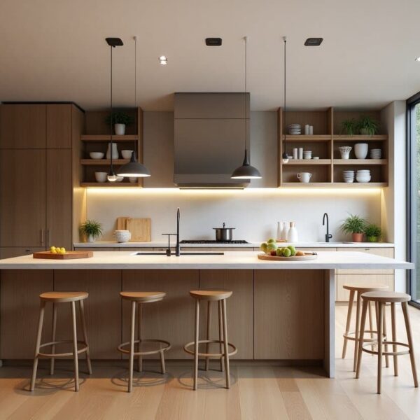
Europe: Minimalist & Functional Logic
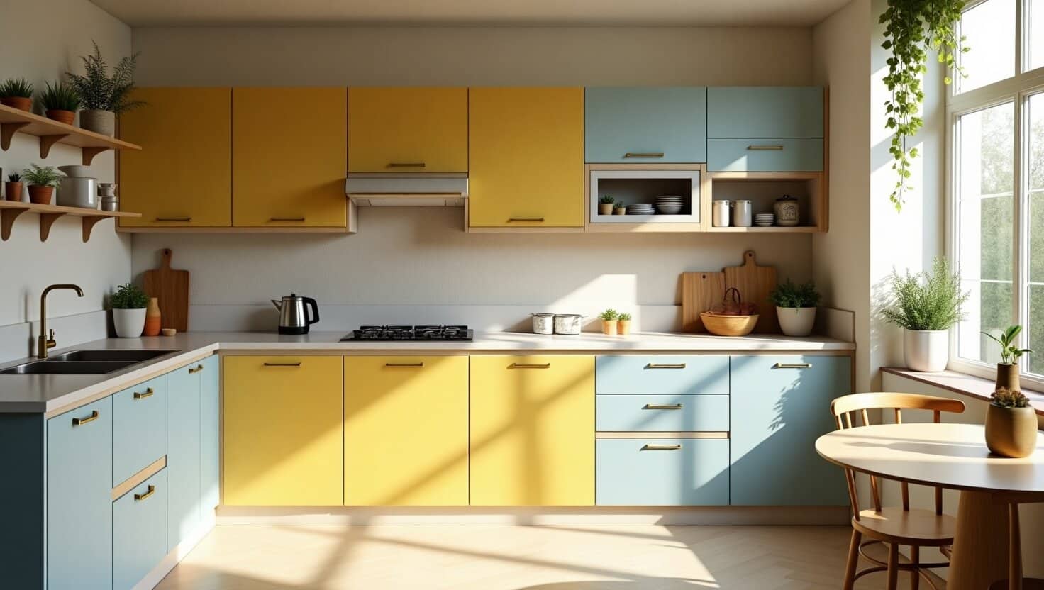
European design follows a “minimalist logic” emphasizing practicality, natural light, and restraint. Nordic countries often use light gray, white, and natural wood. This stems from “Scandinavian minimalism” (Hygge culture), prioritizing practicality and natural light, with natural wood from forests bringing warmth. Forest green, reflecting Sámi nature worship, can be moderated with light oak countertops, while glacial gray (low saturation) often relies on artificial lighting for compensation. The Mediterranean region features earth yellow and light blue. Earth yellow, from adobe walls, symbolizes sun and land, while light blue, representing the Mediterranean Sea, signifies coolness and freedom. Greek navy blue, reflecting maritime civilization, requires white plastered walls to balance the visual impact.
Americas: Dynamic & Diverse Blends
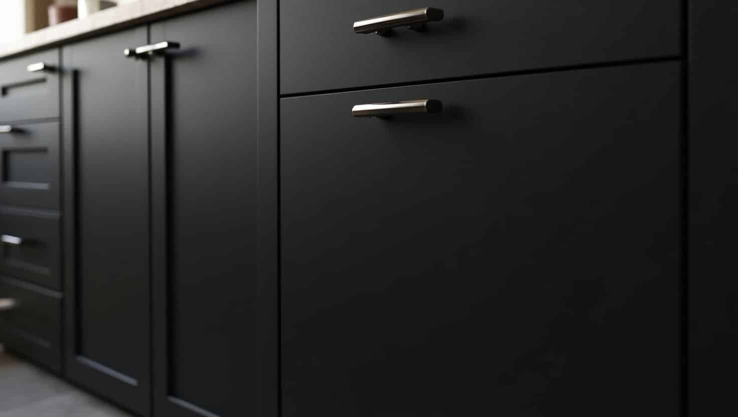
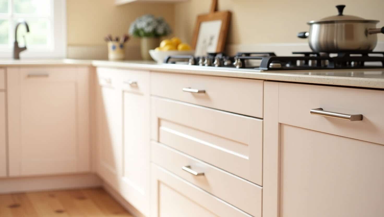
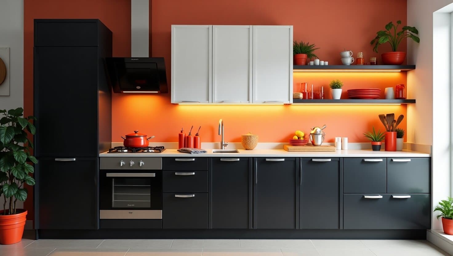
The Americas present a “dynamic blend” of diversity and fusion, a vibrant experiment of immigrant cultures. In Mexico, bright yellow, red, and blue are prominent. Bright yellow, from the Mayan “sun god,” symbolizes harvest and power; red and blue, from the Mexican flag, symbolize independence and unity, echoing “Talavera tiles.” Terracotta red, a nod to pottery tradition, can be mixed with stainless steel countertops for a collision of traditional and industrial styles. The United States often uses black, white, and gray as a foundation with accent colors. Black, white, and gray form the basis of modern minimalism, with accent colors reflecting diverse cultures (e.g., California “Bohemian,” New York “Industrial”). American farmhouse white, a “purity narrative” from colonial history, needs brass hardware accents to avoid monotony.
Practical Advice for Your Kitchen Cabinet Color Choice
Now that you’re armed with this cultural kaleidoscope, how do you make the right choice for your kitchen?
What colors make you feel at ease? Ultimately, your kitchen should be a space that brings you joy. Treat cultural palettes as inspiration, not limitations. Feel free to blend and adapt to create a unique reflection of your style. Always test color swatches, observing how colors appear under different lighting conditions and with various material textures. Don’t hesitate to ask your China cabinet supplier for samples and material recommendations. A good China kitchen cabinet manufacturer will be happy to assist you in making informed choices.
Why Choose NextHome Furnishing for Your Dream Kitchen?
Contact NextHome Now!
We are here to help you with your business needs. We have a team of experts who are always eager to help you.